एनालिटिक्स
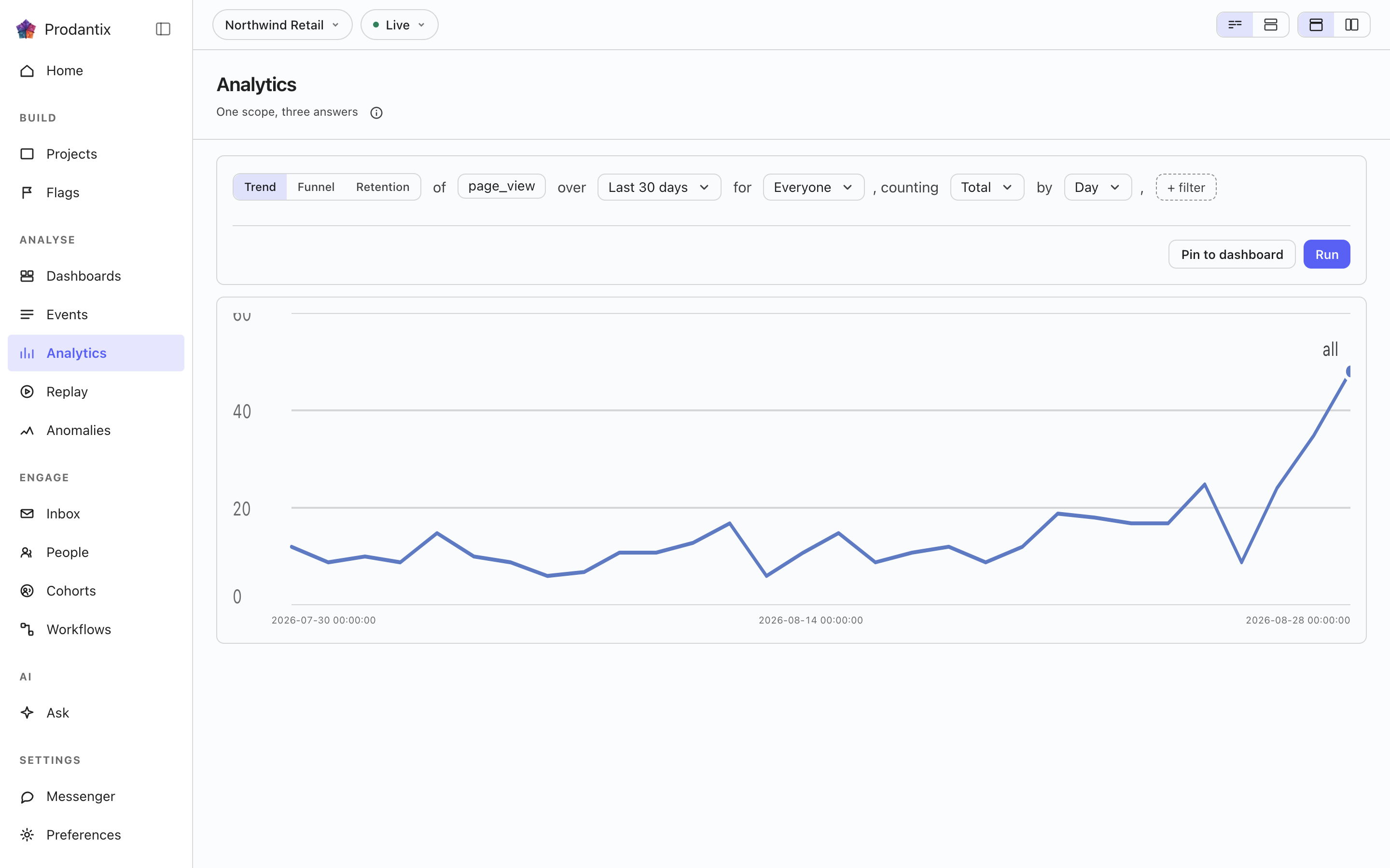
वर्कबेंच: एक सवाल वाक्य की तरह लिखा जाता है और तीन तरीकों से पूछा जाता है, ट्रेंड, फ़नल या रिटेंशन। नतीजा वहीं बनता है, और रखने लायक हो तो डैशबोर्ड पर पिन हो जाता है।
Six modes, one question
A trend counts one event over a range, as totals or unique people, at a granularity the range makes sensible. A funnel orders two or more steps and reports who made it through each. Retention asks who came back: an entry event, a return event and a matrix of periods. Paths asks what happened next, stickiness how many days a period's users came back on, and lifecycle who was new, returning, resurrecting or dormant in each period. Switching modes keeps everything the modes share, so a trend refined into a funnel does not start over.
Metrics and formulas


A trend is not one measure: Add a metric appends a letter, B onward, each its own event and its own total or unique users measure, the scope event staying letter A. Add a formula turns a row into an expression combining those letters with decimal numbers and + - * /, grouped with parentheses, up to 200 characters and never another formula's own letter. A point the formula cannot compute, a division by zero among them, draws as a gap rather than a zero.
The compared period


Compare asks the same question again over the window right before this one: Previous Period, Previous Day, Previous Week, Previous Month, Previous Quarter or Previous Year. Every series in the result gets a past twin, drawn apart from the current one rather than as a plain extra line, and the scope note names which one is picked. The compared period draws on Line, Stacked Line, Column, Stacked Column, Bar, Stacked Bar, Table and Metric; Pie draws the current period only.
Breakdowns


Breakdowns split a trend by up to three fields at once, an event property or one of the columns the DSL allow-lists: every series in the result carries the tuple of values it is one combination of, in the breakdowns' own order. The table reads every combination as its own row; the other chart types read the first breakdown as the series and fold the rest into its key.
Paths: what happened next


Paths start from an anchor event and walk one to five steps forward, or backward, within the anchor's session or a window of minutes or hours. Each step reports its top three, five or ten events with the share of that step's users, the events past the top folded into one row, and the users who took no further step. The default reading is one column per step; the same result reads as a sankey, with a block per event and a ribbon into each block of the next step, or as a tree that nests the next step's events under each event until its caret opens it.
Step by तय करता है कि एक चरण क्या है। इवेंट से, यह चाल एंकर के बाद के शीर्ष इवेंट नाम होती है। पेज से, यह केवल पेज व्यू देखती है और हर चरण की कुंजी होस्ट के साथ पथनाम होती है, इसलिए चाल पढ़ी जाती है मूल्य, साइन-अप, चेकआउट, न कि पेज व्यू, पेज व्यू, पेज व्यू। एंकर भी साथ बदलता है: इवेंट फ़ील्ड उन पेजों का पिकर बन जाता है जिन तक विज़िटर उस अवधि में वास्तव में पहुँचे, उपयोगकर्ताओं के हिसाब से शीर्ष सौ, क्योंकि हाथ से टाइप किए गए पेज एंकर को कुछ भी उत्तर देने के लिए होस्ट और पथनाम से बिलकुल मेल खाना पड़ता। सैंकी और ट्री में एक पेज चरण पथनाम बनाता है और उसका होस्ट धीमे उपसर्ग के रूप में रखता है, ताकि एक ही पथ साझा करने वाले दो होस्ट अलग पहचाने जा सकें।
Stickiness: how many days


Stickiness counts, for each week or month, how many of the event's users were active on one, two, three and more of its days. The result row steps between periods; the column chart reads one period at a time, and the table reads all of them.
Lifecycle: new, returning, resurrecting, dormant


Lifecycle sorts each period's users into four states: new were first seen in the period, returning were active in it and the period before, resurrecting came back after a period away, and dormant were active the period before and not in this one. First-seen reads the whole retained history, so a user is new once; activity is read one period before the range, so the first period's returning and dormant counts are real rather than zero by construction. The stacked column draws dormant below the zero line; the table adds a net column.
The sentence and its clauses


The question reads as a sentence: measure, event, range and any clauses, each word an editable control with the project's own event names suggested as you type. Property clauses narrow by what an event carried; a cohort clause scopes the whole question to a saved cohort. Whether the question composes as one sentence or as labelled groups is a stored preference, as is the split or stacked layout; nothing runs until Run, so a half-edited question never fires.
माप, इवेंट और बहिष्करण
हर मेट्रिक अपने इवेंट कुल संख्या में या अद्वितीय उपयोगकर्ताओं के रूप में गिनता है, या उनमें आई कोई संख्या पढ़ता है: माप चयनकर्ता Count, Sum of और Average of के समूह बनाता है, और आखिरी दो उन सभी प्रॉपर्टी की सूची देते हैं जो मेट्रिक के इवेंट ने संख्या के रूप में भेजीं, तब पंक्ति the sum of amount पढ़ी जाती है। मेट्रिक का इवेंट फ़ील्ड 8 तक इवेंट लेता है, जिन्हें मेट्रिक के अक्षर के नीचे एक ही सीरीज़ के रूप में साथ गिना जाता है और उसके लेबल में हर गिना गया इवेंट होता है। ट्रेंड में, कोहोर्ट के बाद Exclude People who did an event को बाहर करता है, यानी जिन्होंने अवधि में अधिकतम 8 इवेंट में से कोई भी किया, A cohort को जो उस कोहोर्ट से अलग हो जिस तक सवाल सीमित है, या दोनों को; हर ब्रेकडाउन भी अपने से बाहर रखे जाने वाले मान लेता है। अवधि तारीख चयनकर्ता है: Today, Yesterday, Last 7 days, Last 30 days, Last 3 months, Last 6 months और Last 12 months, या उसके दो महीने के कैलेंडर पर चुनी गई दिनों की कोई भी अवधि। दिन UTC दिन हैं, जैसे डेटा वेयरहाउस उन्हें गिनता है, और सापेक्ष अवधि नाम से सहेजी जाती है, इसलिए Last 30 days पर सहेजी गई रिपोर्ट हमेशा पिछले 30 दिन पढ़ती है। वायर पर मेट्रिक अपने अतिरिक्त इवेंट orEvents में ले जाता है, क्वेरी excludeDid और excludeCohort ले जाती है, और प्रॉपर्टी की सूची eventCatalog पर numericProperties है।
Reading a result as another chart


Every result row ends with the chart type it is read in. The menu lists Line, Stacked Line, Column, Stacked Column, Bar, Stacked Bar, Pie, Table, Metric, Funnel Steps, Retention Curve, Ranked Columns, Sankey and Tree, in that order, with the ones the result cannot take greyed rather than hidden. A trend, a stickiness period and a lifecycle take any of the series types; funnel steps take a funnel; the retention curve draws one line per cohort over its matrix; ranked columns, the sankey and the tree read paths; the table reads everything. Each mode remembers the type you chose, the URL carries it as ?chart=, and a pinned tile keeps it.
चार्ट सेटिंग्स
चार्ट प्रकार के पास का सेटिंग्स बटन चार्ट की अपनी सेटिंग्स खोलता है, पॉपओवर के रूप में, चार्ट के पास एक पैनल के रूप में या एक डायलॉग के रूप में, जैसा पेज का लेआउट चयनकर्ता बताए। Left axis और Right axis टैब तय करते हैं कि हर अक्ष दिखे या नहीं, उसका शीर्षक, उसकी इकाई (गिनती, मुद्रा, प्रतिशत या कस्टम), एक उपसर्ग और प्रत्यय, बड़ी संख्याएं संक्षिप्त हों या नहीं, कितने दशमलव परिणाम के पूर्वावलोकन के साथ, तय न्यूनतम और अधिकतम सीमाएं जिनसे आगे के मान किनारे पर काटे जाते हैं या छोड़ दिए जाते हैं, और रैखिक या लघुगणकीय पैमाना। Time axis टैब समय अक्ष दिखाता या छिपाता है, उसे शीर्षक देता है और दैनिक या घंटेवार चार्ट पर सप्ताहांत को छायांकित करता है। Series टैब हर मेट्रिक या फ़ॉर्मूले को बाएं या दाएं अक्ष पर ले जाता है, जो सवाल में हर मेट्रिक की अपनी पंक्ति भी करती है, और Standard पैलेट या रंग-अंधता के लिए सुरक्षित पैलेट चुनता है। हर बदलाव चार्ट को तुरंत फिर से बनाता है; सहेजी गई रिपोर्ट या इनसाइट अपनी सेटिंग्स रखती है, उसका संस्करण इतिहास उनके बदलाव का नाम लेता है, और पिन की गई टाइल उन्हीं से बनती है, फ़ोन पर भी। वायर पर ये रिपोर्ट, इनसाइट और टाइल पर viz के पास chart फ़ील्ड के रूप में जाती हैं।
परिणाम तालिका
चार्ट के नीचे एक ट्रेंड की परिणाम तालिका हर सीरीज़ के लिए एक पंक्ति दिखाती है: वह रंग जिसमें उसकी रेखा बनी है, उसके ब्रेकडाउन मान (या उसका मेट्रिक जब सवाल में कई अक्षर हों या कोई ब्रेकडाउन न हो), एक योग कॉलम और हर अवधि के लिए एक कॉलम, और ट्रेंड की तुलना होने पर हर अवधि के पास उसका पिछला जुड़वां। किसी पंक्ति का चेकबॉक्स खाली करने या उसके रंग पर क्लिक करने से उसकी रेखा चार्ट से हट जाती है; पंक्ति खोखले रंग के साथ फीकी होकर तालिका में रहती है, लीजेंड उसे खोखला रखता है, और हेडर का चेकबॉक्स सभी पंक्तियां वापस लाता है या सभी हटा देता है। तालिका के ऊपर का खोज फ़ील्ड पंक्तियों को उन तक सीमित करता है जिनके मानों में लिखा गया पाठ हो, और कभी चार्ट से कोई रेखा नहीं हटाता। परिणाम पंक्ति का व्यू समूह चार्ट, तालिका और चार्ट और तालिका के बीच बदलता है, और परिणाम चार्ट और तालिका में खुलता है; चार्ट का प्रकार तालिका होने पर तालिका ही चार्ट है, इसलिए समूह हट जाता है। व्यू और हटाई गई पंक्तियां चार्ट सेटिंग्स के हिस्से के रूप में रिपोर्ट के साथ chart फ़ील्ड में view और hidden के रूप में सहेजी जाती हैं, इसलिए सहेजी गई रिपोर्ट, इनसाइट और पिन की गई टाइल वही रेखाएं बनाती हैं, फ़ोन पर भी। बाकी मोड चार्ट के नीचे अपनी तालिका दिखाते हैं, खोज के साथ और पंक्ति चुनने के बिना।
चार्ट के ऊपर की पंक्ति बताती है कि परिणाम कितनी देर पहले चलाया गया था, और चार्ट सेटिंग्स के पास ताज़ा करें वही प्रश्न फिर से पूछता है। उसके बाद वाक्य में किए गए बदलाव चलाएं का इंतज़ार करते हैं।
किसी बिंदु पर कार्रवाई
चार्ट के किसी बिंदु पर क्लिक करने से एक मेनू खुलता है जिसका शीर्षक वही बिंदु होता है: उसकी सीरीज़, उसका अंतराल और उसका मान; फ़ोन पर देर तक दबाने से वही मेनू खुलता है। यह रिपोर्ट सवाल बदलकर उसे फिर से चलाती है। ज़ूम इन किसी ट्रेंड या लाइफ़साइकल को क्लिक किए गए अंतराल तक सीमित करता है, एक स्तर बारीक: महीना हफ़्तों में, हफ़्ता दिनों में, और ट्रेंड का दिन घंटों में। ब्रेकडाउन के किसी बिंदु पर फ़िल्टर वाली पंक्ति उसके हर मान के लिए एक फ़िल्टर जोड़ती है और बाहर रखने वाली पंक्ति उसके ब्रेकडाउन से एक मान हटाती है, हर मान के लिए एक पंक्ति; बिना ब्रेकडाउन वाले बिंदु पर दोनों इस पर फ़िल्टर करें और इसे बाहर रखें के रूप में धूसर रहती हैं। करीब से देखें हर मोड में बताता है कि बिंदु किन लोगों और किन घटनाओं से बना: ट्रेंड या लाइफ़साइकल का अंतराल, फ़नल का चरण, रिटेंशन का सेल, पाथ पर इवेंट और स्टिकीनेस का कॉलम, सभी अपने-अपने बताते हैं। उपयोगकर्ता देखें, इवेंट देखें और रीप्ले देखें उन्हें डिफ़ॉल्ट रूप से एक डायलॉग में खोलते हैं, या एनालिटिक्स पेज के चयनकर्ता के अनुसार साइड पैनल में या पेज पर ही। लोग में खोलें, या इवेंट, या रिप्ले, बिंदु को उस पेज पर ले जाता है, जहाँ एक चिप उसका नाम बताती है और उसे हटाती है; जब चयनकर्ता बिंदु को सीधे पेज पर भेजता है, तो रिपोर्ट पर वापस जाएँ सवाल पर लौटाता है। समझाएँ में मूल कारण विश्लेषण है: किसी ऐसे ट्रेंड बिंदु पर जिससे पहले एक अंतराल हो और जो कुल या अद्वितीय उपयोगकर्ता गिनता हो, यह Ask में सवाल तैयार करता है कि दोनों के बीच रेखा क्यों बढ़ी या घटी। API में बिंदु projectPeople और replaySessions के point आर्ग्युमेंट के रूप में और events के फ़िल्टर में जाता है: रिपोर्ट का प्रकार और क्वेरी, साथ में वह अंतराल, चरण, इवेंट, कोहोर्ट, अवधि, सक्रिय दिन या स्थिति जो उसे बताती है।
एनोटेशन
किसी बिंदु के मेनू में एनोटेशन जोड़ें उस दिन को, या कैलेंडर में चुनी गई अवधि को, एक नोट और अधिकतम दस टैग के साथ चिह्नित करता है। किसी रिपोर्ट पर कहां दिखेगा एनोटेशन को केवल उस रिपोर्ट तक रखता है या प्रोजेक्ट के हर उस चार्ट पर दिखाता है जिसकी तारीखें इसे शामिल करती हैं; जो प्रश्न रिपोर्ट के रूप में सहेजा नहीं गया, वह इसे प्रोजेक्ट के चार्ट पर दिखाता है। तारीख की धुरी पर एक मार्कर रहता है: उस पर पॉइंटर ले जाने पर उसकी रेखा और नोट, टैग, दिन व जोड़ने वाले के नाम वाला एक कार्ड बनता है, और क्लिक करने पर कार्ड उसके लेखक और एनोटेशन लिखने की अनुमति वाले हर व्यक्ति के लिए संपादित करें और हटाएं के साथ खुला रहता है। चार्ट सेटिंग्स का एनोटेशन टैब उनकी सूची देता है और आपके बंद किए गए टैग छिपाता है, जो रिपोर्ट के साथ सहेजे जाते हैं, और बोर्ड की टाइलें भी वही मार्कर बनाती हैं। API में ये annotations, createAnnotation, updateAnnotation, deleteAnnotation, annotationChanges सब्सक्रिप्शन और /v1/projects/{projectId}/annotations हैं; एजेंट इन्हें prodantix.annotations.list और prodantix.annotations.create से पढ़ते और जोड़ते हैं।
Results, and keeping them
A trend draws as a series, a funnel as its steps with the drop between them, retention as a matrix whose rows are entry periods, paths as ranked columns per step, stickiness as columns over days active and lifecycle as a stacked column. Once a result exists, Pin saves the question to a board on Saved, where its tile re-runs the query on every open and draws it as the chart type it was pinned in.
Pin के बगल में Save है। इसकी पहली पंक्ति As an insight है: सवाल को पूरा, एडिटर और चार्ट सहित, एक प्रॉम्प्ट में पूछे गए नाम के तहत रखा जाता है, और फिर कार्ड का शीर्ष खुले इनसाइट को एक चिप पर बताता है; पता ?insight= रखता है, इसलिए लिंक उसे फिर खोलता है। सवाल संपादित करें और चिप नाम के बाद changed पढ़ती है जब तक Save की पहली पंक्ति, अब Update, संपादन को सहेजे गए के ऊपर न लिख दे, या उसकी दूसरी पंक्ति, Save as a new insight, संपादन को दूसरे इनसाइट के रूप में न रख ले। अगली पंक्ति Users as a cohort है: यह उन लोगों का नाम रखती है जिन्हें किसी परिणाम ने गिना और उन्हें स्थिर कोहॉर्ट के रूप में रखती है। सूची सर्वर पर उस क्वेरी से बनती है जैसी वह चली थी, इसलिए इसमें वे सब हैं जिन्हें परिणाम ने गिना, न कि वे जिन्हें चार्ट ने बनाया, 100,000 तक, और जिस परिणाम ने किसी को नहीं गिना उसे अस्वीकार किया जाता है। कोहॉर्ट उस वाक्य को रखती है जिसके तहत उसे पढ़ा गया, और स्थिर सूची होने से उसका फिर से मूल्यांकन कभी नहीं होता: अगले हफ्ते पूछा गया वही सवाल अगले हफ्ते के बारे में जवाब देता है, जबकि कोहॉर्ट में अब भी वही हैं जिन्हें आज गिना गया। सहेजे गए इनसाइट Saved के Insights टैब में सूचीबद्ध हैं। एक विभाजक के नीचे CSV निर्यात करें है: सर्वर परिणाम को उस क्वेरी से स्प्रेडशीट के रूप में लिखता है जैसी वह चली थी, हर अवधि और ब्रेकडाउन के लिए एक पंक्ति और हर मेट्रिक अक्षर के लिए एक कॉलम, चार्ट के शीर्ष कुछ के बजाय इंजन के हज़ार तक हर संयोजन, और फ़ाइल का नाम टूल और सीमा के अनुसार रखता है। अंत में आता है सीमा पर नज़र रखें, जो केवल ट्रेंड परिणाम पर काम करता है: यह परिणाम को इनसाइट के रूप में सहेजता है यदि यह अभी तक एक नहीं है, फिर अपने पहले मेट्रिक पर एक सीमा बताता है, ऊपर, नीचे या किसी मान से बदलते हुए, जिसे दिन में एक बार इनसाइट के अंतिम पूर्ण बकेट पर जांचा जाता है; जब तक सीमा पार होती है इनसाइट आपकी ज़रूरत में सूचीबद्ध रहती है और फिर से खोला गया इनसाइट सीमा को अपने चार्ट पर एक बैंड के रूप में खींचता है, और मान वापस आने पर अलर्ट अपने आप हट जाता है।
Save as report सवाल को एक बोर्ड पर रिपोर्ट के रूप में रखता है, दो चरणों में: पहले नाम और एक विवरण, फिर बोर्ड, तीन पंक्तियों ऊंची खोजी जा सकने वाली सूची से चुना गया, नीचे New board के साथ। फिर पता ?report= रखता है, पृष्ठ का शीर्ष प्रोजेक्ट › बोर्ड › रिपोर्ट पढ़ता है जिसमें बोर्ड एक लिंक है, और कार्ड का शीर्ष खुली रिपोर्ट को एक चिप पर बताता है, जो एडिटर के सहेजे गए से अलग होते ही नाम के बाद changed पढ़ता है, जब तक Save report संपादन को अगले संस्करण के रूप में नहीं लिखता या Save as new report उसे दूसरी रिपोर्ट के रूप में नहीं रखता। रिपोर्ट खुली होने पर Save मेनू उसका नाम भी बदलता है, उसे दूसरे बोर्ड पर ले जाता है या कॉपी करता है; ले जाना तुरंत हो जाता है और स्नैकबार Undo के साथ यह बताता है। कार्ड के नीचे संस्करण पट्टी वर्तमान संस्करण, किसने और कब सहेजा, बताती है; Show history हर संस्करण खोलता है, क्या बदला, किसने और कब, तीन प्रविष्टियां दिखती हैं, वर्तमान को छोड़कर हर एक के पास Restore, और बहाली इतिहास को फिर से लिखने के बजाय चुने हुए की कॉपी के रूप में एक नया संस्करण लिखती है। रिपोर्ट Saved के Reports टैब पर सूचीबद्ध हैं।
रिपोर्ट साझा करना
सहेजी गई रिपोर्ट खुली हो तो रन पंक्ति Copy link और Share देती है। Copy link रिपोर्ट का पता उसकी अवधि, कोहोर्ट और फ़िल्टर समेत कॉपी करता है, और यह कंपनी में हर उस व्यक्ति के लिए खुलता है जो रिपोर्ट खोल सकता है। Share दो टैब खोलता है, पहले Teammates। Teammates रिपोर्ट को कंपनी के ज़्यादा से ज़्यादा 20 लोगों को भेजता है, आप नोट जोड़ें तो उसके साथ: हर किसी को यह कंसोल की सूचनाओं में मिलती है, जहाँ उन्होंने पुश चालू किए हैं वहाँ पुश के रूप में, और ईमेल से। डायलॉग खुला रहता है और बताता है कि इसे किसे भेजा गया।
Public link एक केवल पढ़ने वाला पेज बनाता है जिसे लिंक वाला कोई भी बिना साइन इन किए खोल सकता है: रिपोर्ट अपने पिछले रन के अनुसार, अपने चार्ट और संख्याओं के साथ पर अपने सवाल के फ़िल्टर, कोहोर्ट या लोगों के बिना, और सहेजे गए रूप में रिपोर्ट का हर रन इसे ताज़ा करता है। लिंक चुने गए दिन के अंत में काम करना बंद कर देता है, कल से 90 दिनों तक, शुरुआत In 30 days से; चालू रहते दूसरा दिन चुनना इसे नवीनीकृत करता है, और बंद करना इसे तुरंत रोक देता है। सार्वजनिक लिंक बनाने के लिए अलग अनुमति चाहिए, जो एजेंट के पास कभी नहीं होती, और जिस भूमिका के पास यह नहीं है उसे स्विच अक्षम दिखता है, साथ में एक पंक्ति जो यह बताती है।
Where this meets the API
The concept is the Analytics pillar. On the wire, the six modes are six queries: runQuery, runFunnel, runRetention, runPaths, runStickiness and runLifecycle, with event names suggested from eventCatalog and, for a path stepping by page, the anchors from pathsPages (GraphQL reference). Pinning writes the question into a board through updateDashboard, with the report's kind and the chart type beside its query; saving an insight is createInsight, Update is updateInsight, and Saved's Insights tab reads insights. Save as report is createReport, Save report is updateReport, the strip's Restore is restoreReportVersion, and Saved's Reports tab reads reports. Sharing reads the public link with reportPublicLink, turns it on or renews it with setReportPublicLink, turns it off with turnOffReportPublicLink and sends to teammates with shareReport, while reportShareChanges streams every change; a visitor's page reads /v1/shared-reports/{token} (API reference).